Developing quantitative indices for Nepal

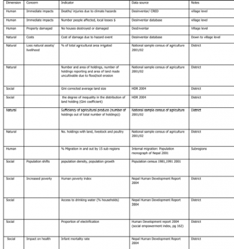
In the next steps quantitative indicators of vulnerability are developed by linking to the qualitative concerns revealed in the exposure matrix. As shown in Table 2 the aim is to link the indicators to the specific concerns recognised by the exposure matrix. In this case the dimensions have been divided into human, natural, economic and social indices. For each of these the concerns related to the climate hazards identified are listed and possible indicators identified.
The approach to the use of indicators would vary depending on the question being addressed. In a local context the most vulnerable livelihoods and/or households could be identified with the community by focusing using the approach in the exposure table on their specific livelihoods and concerns. If the assessment is trying to represent the entire country then a range of profiles for the representative major livelihoods groups and regions (chosen by the country study group) could be conducted to represent the country.
The next step is to explore the structure of the indicator database. What is the range of values? Are there critical thresholds for vulnerability? Are indicators correlated with each other? Are there clusters in the data that capture higher order factors (perhaps corresponding to the original definition)? The next step, commonly done, is to transform the indicators into some sort of standard scores. These scores are mapped using GIS to identify geographic “hot spots”. Standard scores are the relative location between the low and high value in the data set, generally in the range of 0 to 1 or 0 to 100. For example, an international comparison of GNP per capita can be expressed as the 0=the minimum (some $200) and 100=the maximum (some $20,000). Most studies come up with an aggregate vulnerability index by adding indicators across categories. For instance, a food security index might be the average of indicators of crop yield, income and nutritional status. Most studies do not weight the indicators analysts recognise that users may have different weights in mind.
However, there are a range of aggregation techniques beyond summing up standard scores (whether weighted or not). Critical failures and the concatenation of risks might be captured by only counting low scores. Targeting to specific socioeconomic, vulnerable groups might imply a choice of “indicators”, for instance food security among pastoralists is not well represented by maize yields. Validation of indices is very difficult but the mapped vulnerability indices should at least be discussed with experts and also in the case of localised studies mapped information can be presented and information be exchanged back and forth with communities groups involved.

Composite socio-economic vulnerability indices
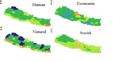
In our example many indices were tabled, grouped into social, natural, human or economic (based on the approach of Thornton, P., Mapping climate poverty and vulnerability in Africa, 2006), the indices were correlated, parred down to 24 in total and then standardised to values from 0 to 5, 5 being the most vulnerable. When all the indices then mapped and compared the regions with the highest vulnerability (higher that 2.5) for all factors are the mountain and hill regions of the Far-west and West and two further border mountain districts in the Central and East regions.

Background to ACCCA Nepal Project
Background on Disasters in Nepal
Nepal Vulnerability Assessment
Nepal Assessing Conditions and Trends
Identifying Climatic Hazards in Nepal
Understanding Trends in Climatic Hazards in Nepal
Other work on Adaptation in Nepal:
(0) Comments
There is no content